Branding case study
The studio provides a range of creative and constructive solutions for commercial and public spaces. Sitio was looking to clean up their current image, but we advised to re-brand.
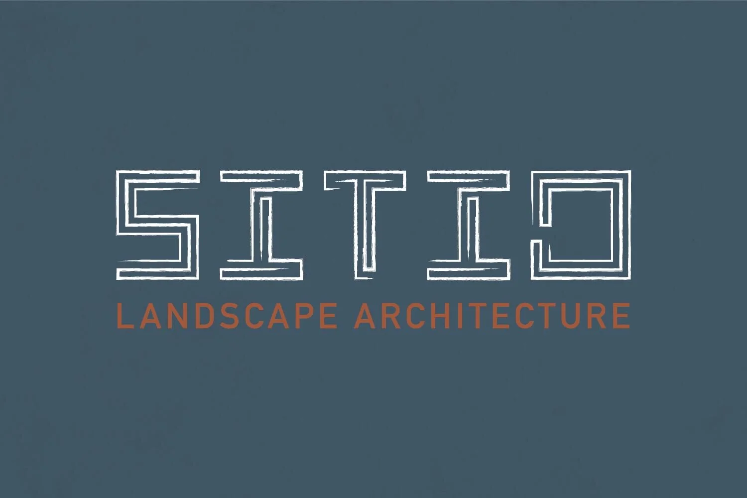
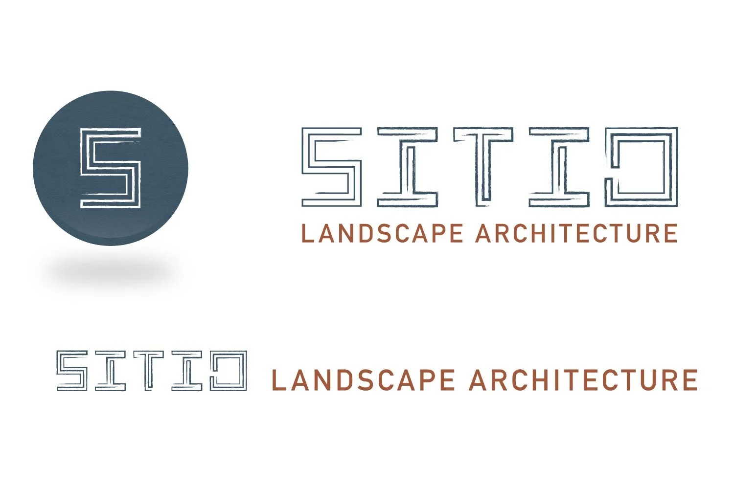
There was a disconnect between the original Sitio logo and the company’s work. Sitio’s logo was confined within a box. Landscape architects work within confinements, but their creativity can’t be contained. They guide themselves, a team and a client through the design process. It’s this sense of leadership that we focused on.
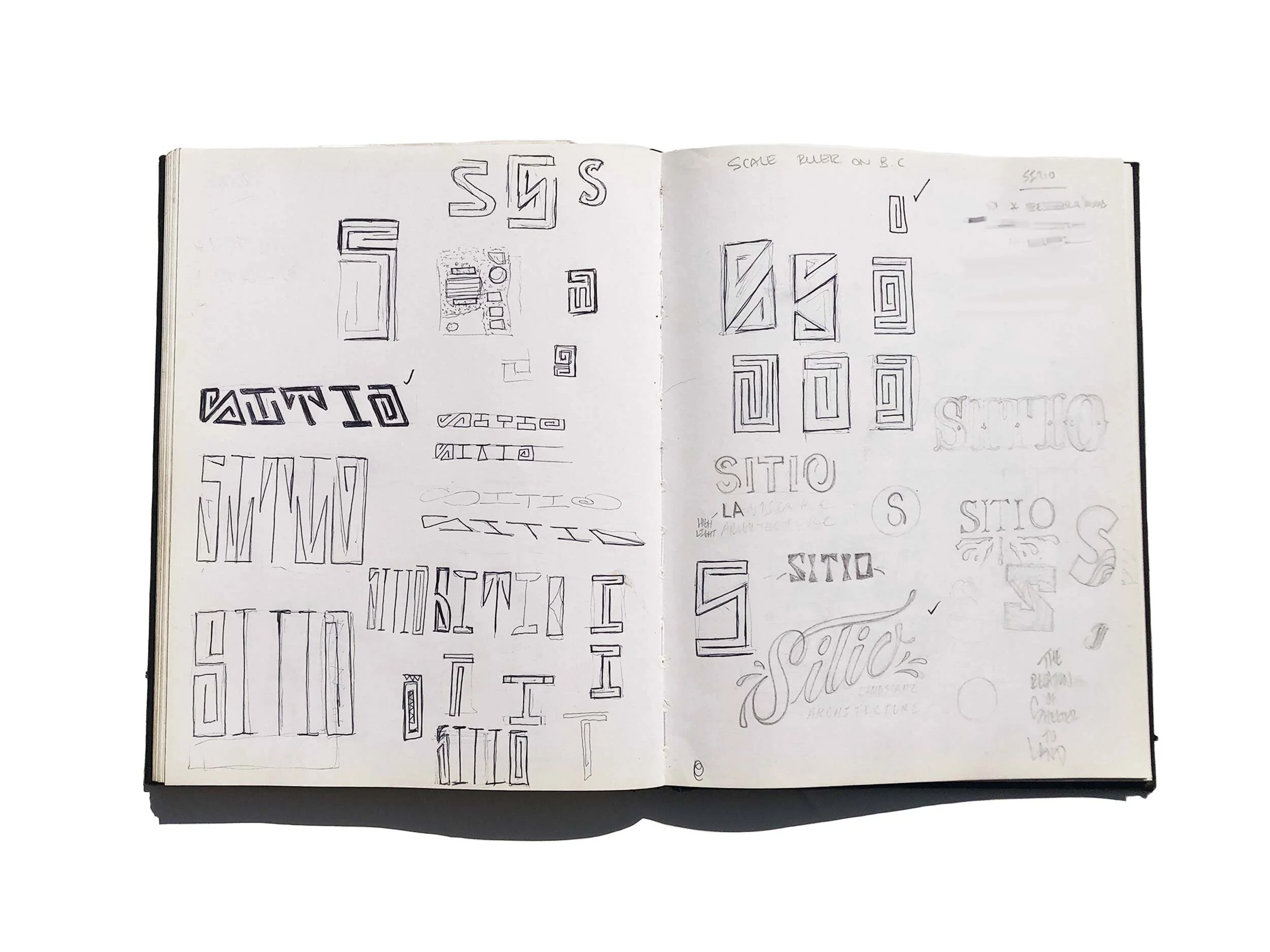
We immediately pulled up companies with the same names to dissociate any of the elements they were using. Sans-serif was the modern choice for most architect landscapers, serif fonts appeared outdated. The first round of sketches brought out cursive lettering with flourishes and we explored creating our own font resembling Mexico’s ’88 Olympics.
Roots always give a solid foundation, driving us forward with what resonated closer to our culture. We created bold lettering that builds and re-constructs itself. Up close there’s breathing room and from a distance, this space fills in to create a solid parameter.
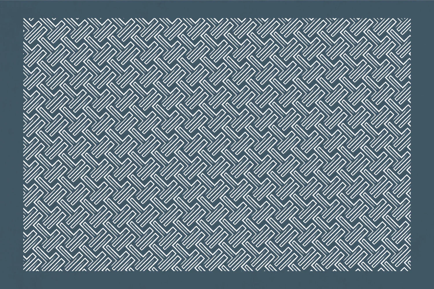
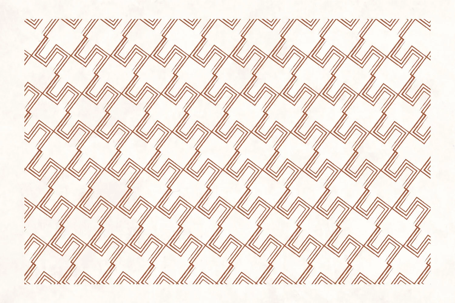
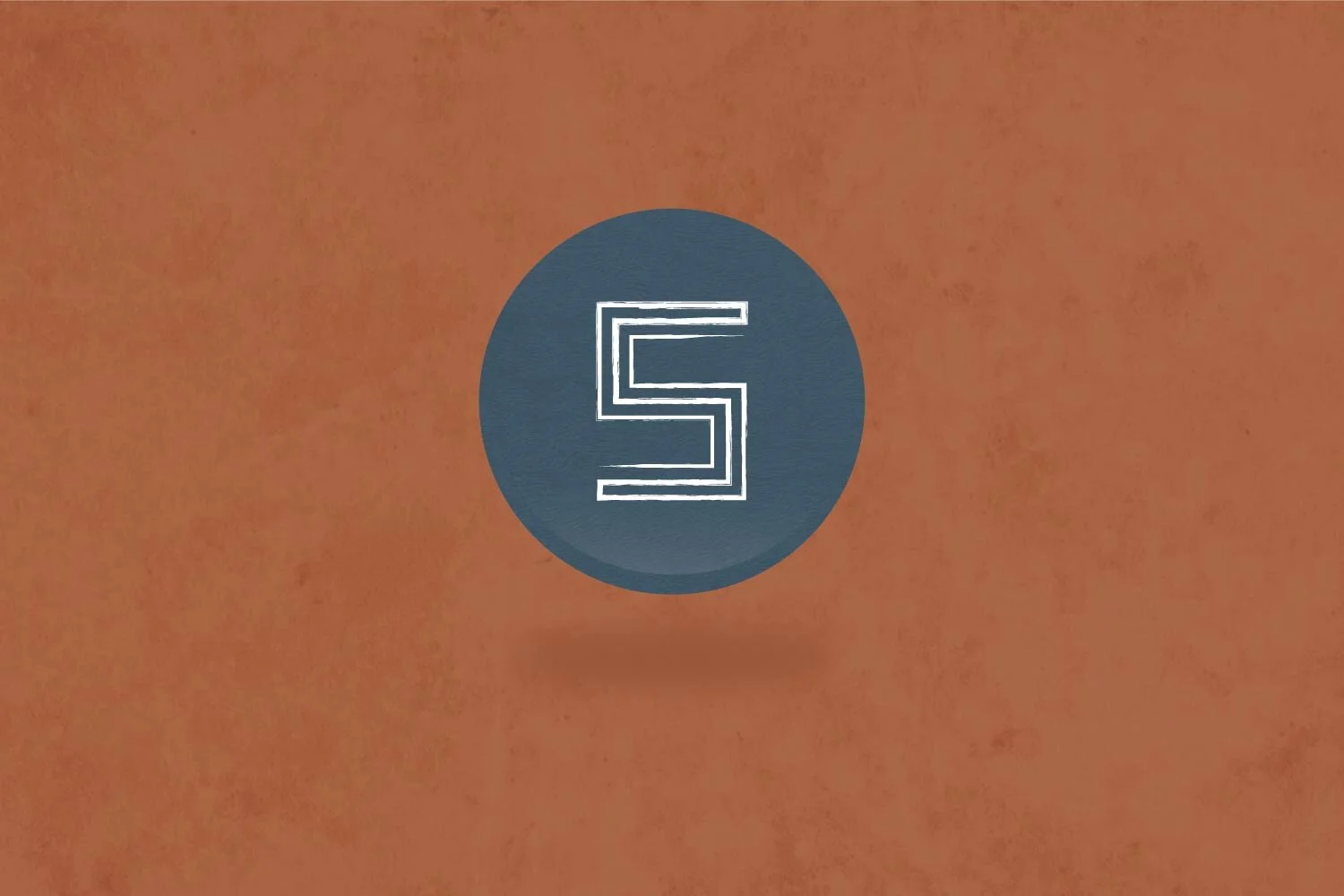
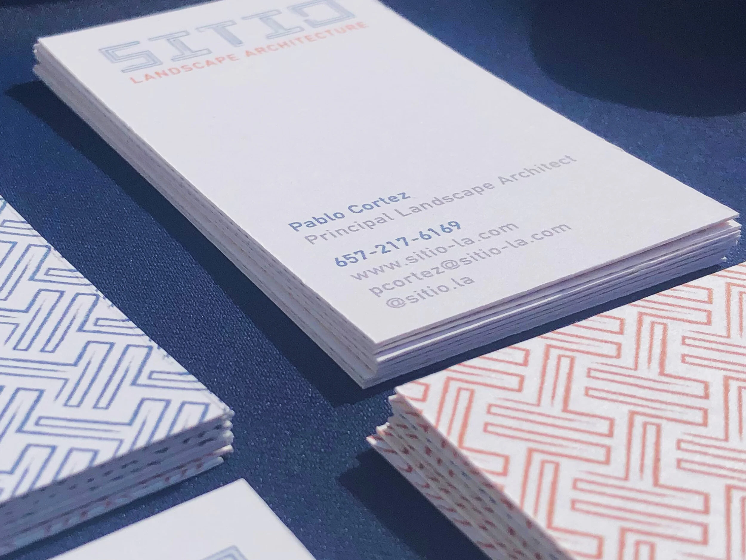
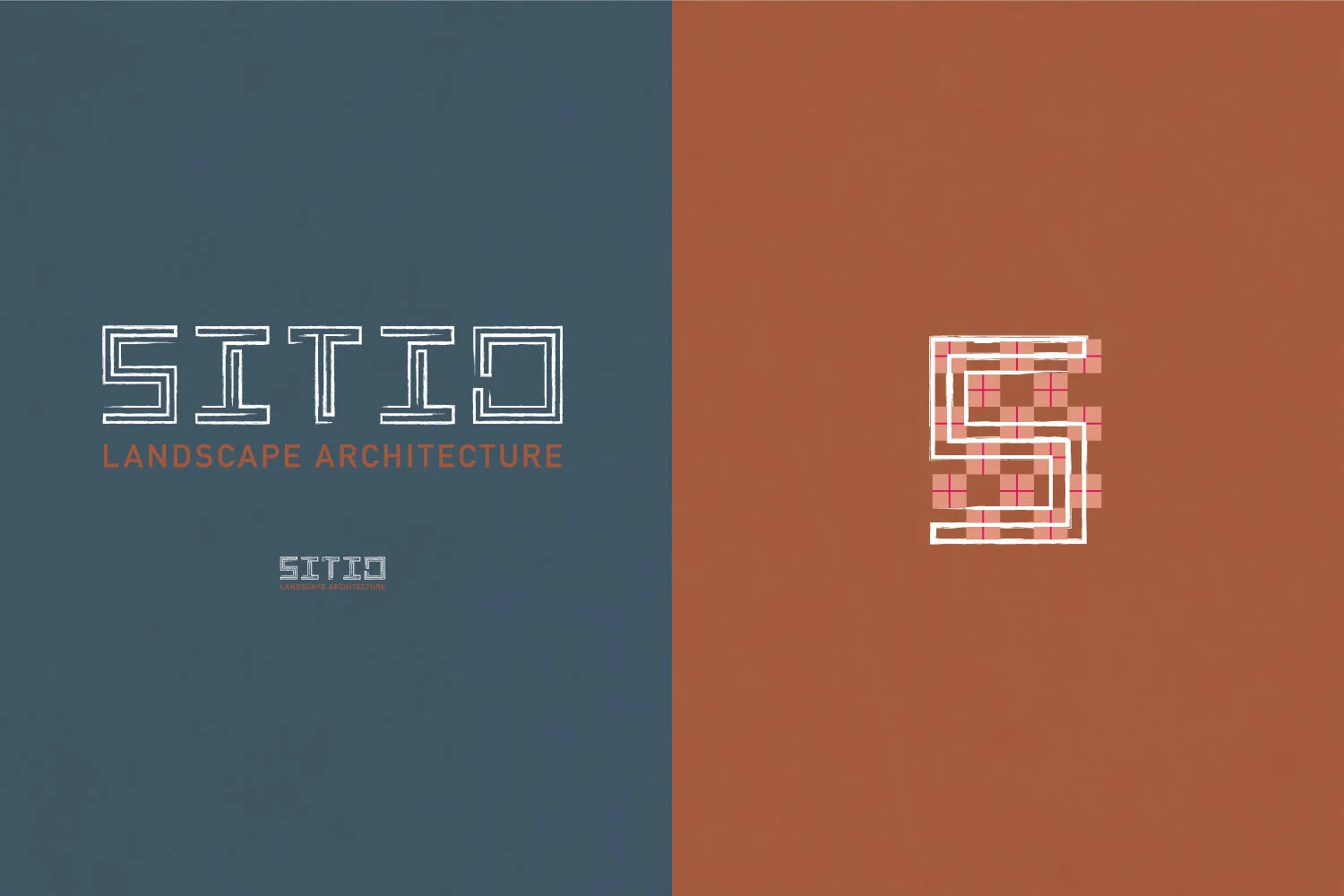
The job requires a set of primal techniques, we drew from indigenous symbolism and patterns. Sitio’s work is produced by artisans who not only specialize in form and function, but also production and maintenance. Our color palette consists of blue rivers and adobe from the earth.
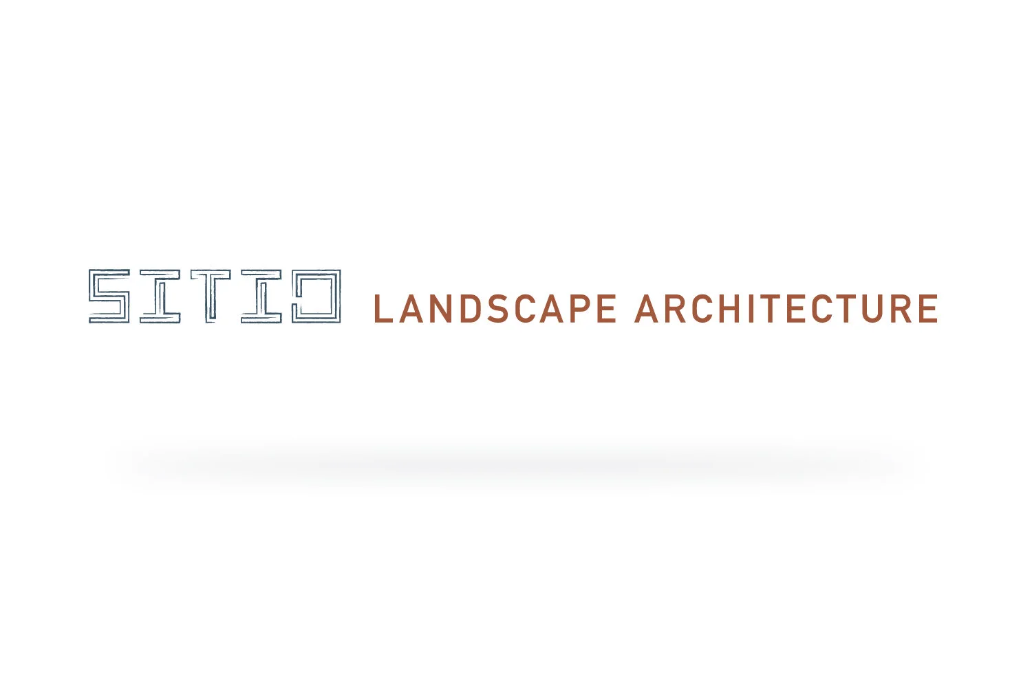
We’re presented with a horizontal and stacked version of Sitio’s logo. Along with an icon, color palette, a set of patterns, with a complimentary primary and secondary typeface. Creating and identifying these brand elements allowed us to move forward with designing their collateral. Future projects such as designing their website and bid presentations are currently in the works.